Why Couples Are Moving Beyond Neutrals
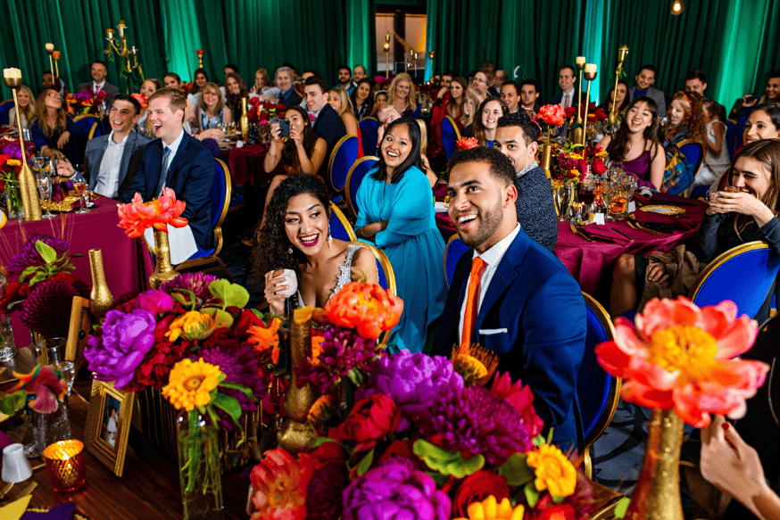
For years, neutral weddings dominated mood boards. Soft beige, pale blush, and ivory linens created clean photos and easy coordination. Now a growing number of couples want something more expressive. Color driven weddings are rising because couples want their celebration to feel like a reflection of their personality rather than a safe template. Color tells a story quickly. It can signal joy, romance, playfulness, or modern edge within seconds of walking into a room.
This does not mean every surface needs to be bright. It means color becomes intentional. Instead of being an afterthought, it becomes a guiding decision that shapes florals, stationery, attire, lighting, and even food presentation. When handled with balance, bold color can look refined, editorial, and timeless.

What Makes A Wedding Truly Color Driven
Color Leads The Design Decisions
In many weddings, the couple chooses a venue, then tries to fit decor into that space. In color driven weddings, the wedding color palette is chosen early. It informs the venue selection, rental choices, and floral direction. When color leads, everything feels cohesive because decisions come from one creative foundation.
Bold Does Not Mean Chaotic
The fear many couples have is that bold color will feel messy or childish. That happens only when color is used without structure. A well planned palette uses contrast, repetition, and negative space. Neutral elements remain, but they are used like framing, not like the main feature.
Choosing A Wedding Color Palette That Feels Elevated
Start With One Anchor Color
Pick one anchor tone that feels emotional to you. It might be emerald, cobalt, marigold, or crimson. This anchor becomes the thread that ties the day together. Once the anchor is chosen, choose two supporting colors and one neutral base. This prevents the palette from drifting.
Consider The Season And Light
Color behaves differently in each season. Spring light is soft, which makes bright colors feel gentle. Summer sun is strong, which can make saturated tones feel intense. Autumn light warms everything, making reds and oranges glow. Winter venues often use artificial lighting, which can deepen jewel tones and make metallic accents shine.
Use Texture To Add Depth
Color feels richer when paired with texture. Velvet ribbons, matte paper, glossy ceramic plates, and raw silk linens create contrast that makes a palette feel layered. This is a key part of sophisticated event design because it prevents the wedding from looking flat.
Statement Florals As A Color Engine
Why Statement Florals Matter
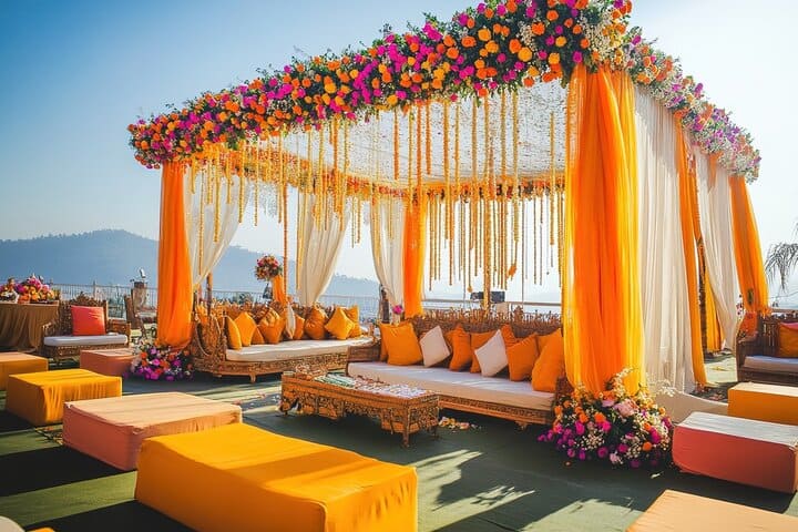
Florals are one of the fastest ways to communicate color. Statement florals are not about quantity. They are about placement and intention. A dramatic ceremony installation, an overhead floral moment, or lush table centerpieces can carry the entire palette.
Using Unexpected Flower Choices
Color driven weddings often use flowers that are not part of the traditional white and blush world. Think anthuriums, orchids, dahlias, ranunculus, delphinium, and dyed carnations. When paired correctly, these blooms look editorial and modern.
For inspiration on modern floral trends and palette pairing, you can explore wedding style features on Brides and design galleries on The Knot.
Styling Rentals That Support Bold Wedding Colors
Table Linens And Layers
One of the best places to introduce bold wedding colors is the table. Colored linens immediately shift the tone of a room. A deep green linen with gold flatware feels luxurious. A bright coral linen with matte white plates feels playful yet elevated. Layer napkins in a contrasting tone to create visual rhythm.

Chair And Furniture Choices
Chairs often get ignored, yet they shape the whole room. Black chairs can ground a bright palette. Clear chairs can make bold tablescape colors pop. Lounge furniture in jewel tones can create an upscale feel in cocktail hour spaces.
Glassware And Plates As Color Details
Colored glassware is a subtle way to bring the palette into guest hands. Amber, smoke, or blue goblets look refined in photos. Patterned plates can add personality, especially in intimate receptions where guests are close enough to notice details.
How To Use Color In Attire Without Overdoing It
Brides And Grooms Embracing Color
More couples are stepping away from traditional all white looks. Brides may wear an ivory gown with a bold colored shoe, a colorful veil edge, or a vibrant bouquet. Grooms may choose colored suits or tux jackets in deep tones like burgundy or forest green.
Wedding Party Styling With Flexibility
A single color across all attendants can look flat. A better approach is to provide a color family and let each person choose their shade. This creates a gradient effect that photographs beautifully and feels less rigid.
Lighting That Enhances Rather Than Fights
Warm Light Makes Color Feel Romantic
Uplighting, candlelight, and string lights can shift how your palette appears. Warm tones soften bright colors. This is why many color driven weddings still feel romantic rather than loud. Use amber based lighting during dinner, then add more dramatic color lighting later for the dance floor.
Use Spotlighting For Dramatic Installations
If you have a bold floral arch or a color rich backdrop, spotlight it gently. This makes the feature stand out and creates a strong visual anchor for photos. Work with your planner or venue team to ensure lighting does not distort your palette.
Using Negative Space For Balance
Where Neutrals Still Matter
Neutral space is what allows bold color to feel elegant. White walls, clear tabletops, or simple linens can frame the more intense elements. This creates breathing room and prevents overwhelm.
Repetition Creates Cohesion
When you repeat one color in multiple places, the design feels intentional. If your anchor color appears in stationery, florals, and a small detail like a cocktail garnish, the palette feels integrated. This is the secret to polished event design.
Practical Planning Tips For Color Driven Weddings
Create A Color Map Before You Spend
Before renting anything, map where your key colors will appear. Ceremony florals. Table linens. Bridesmaid dresses. Signage. Bar styling. This prevents you from overspending on color elements in one area while leaving other areas unfinished.
Test With Swatches And Samples
Ask vendors for linen swatches, ribbon samples, and floral mockups. Color can look different under different lighting. Testing ensures your chosen palette remains consistent across the day.
Work With Vendors Who Love Color
Not every florist or rental company thrives on bold palettes. Choose professionals whose portfolio includes saturated tones and confident styling. They will understand balance and will help you avoid accidental clashes.
Final Thoughts
Color driven weddings are not a rebellion against elegance. They are a return to personality. With a thoughtful wedding color palette, strong statement florals, and balanced use of bold wedding colors, couples can create celebrations that feel artistic, refined, and unforgettable. The key is structure. Choose an anchor color, support it with complementary tones, use neutrals as framing, and repeat color intentionally across the day.