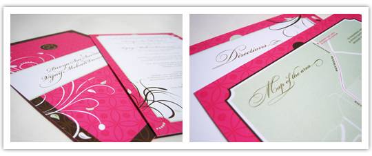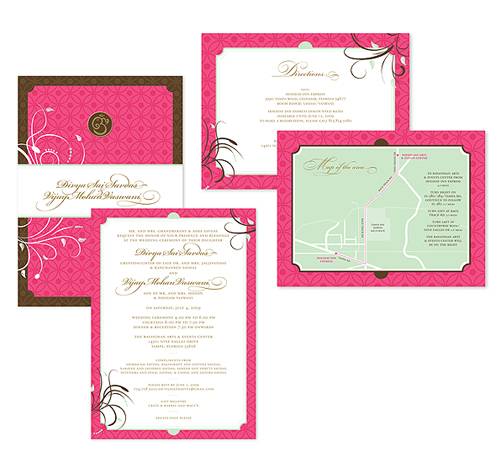
Shikha was kind enough to send me these really fun wedding invitations she designed for her sister’s wedding. Now, I fully admit I know nothing about Indian wedding customs (my family’s background is Jewish, and I’m currently unaffiliated) but I love the rich color that I always see in them. The pink is so daring, and you rarely see that much of it in wedding invitations, so the pop made me smile. I also love the circle and flower pattern in the background!

Here’s some background from Shikha:
This invitation design was largely inspired by the Bride and Groom themselves. The couple wanted a traditional Indian wedding (with all the bells and whistles!), but, as with many first generation Indian-Americans, the mixed cultures in which they were raised played a large part in their aesthetic. The Bride planned to forgo the traditional maroon bridal sari for a hot pink one—this one element played a huge part in the overall look and feel for the entire ceremony. Just like the ceremony they planned, the invitation unites traditional Indian motifs (the Om symbol and the pattern) with more modern elements (the colors and the floral scrolls).
Thanks for sharing, Shikha, and congratulations and best of luck to your sister and her new husband!
Images from the designer, Shikha Savdas
Theres a terrific aumont of knowledge in this article!